TYPOGRAPHY / TASK 1 : EXERCISES
.jpg)
04.04.2023 - 28.04.2023 (Week 1 - Week 5)
TAN JIE YING / 0353959 / BACHELOR IN DESIGN OF CREATIVE MEDIA
TYPOGRAPHY
TASK 1 / EXERCISES
JUMP LINK
LECTURES
What is typography? Typography is a fundamental aspect of every design study. It is an act of creating letters. It can be involved in animation, website design, signage design, etc. Typography has 500 years of evolution (Calligraphy > Lettering > Typography ).
2 types of terminology of typography - font and typeface:
- Font: A font refers to an individual font or weight within a typeface.
Eg. Georgia Regular, Georgia Italic, and Georgia Bold.Eg. Georgia, Arial, Helvetica, Times New Roman, Didot, Comic Sans and Futura


Week 2 // 'Typo_1_Development'
1. Timeline
Early letterform development: Phoenician to Roman.
Writing means scratching into wet clay using a sharpened stick or carving into a stone using a chisel.
The uppercase letter (the only form of lettering for nearly 2000 years) has evolved out of the tools and materials. It was a font of a combination of pieces of circles and straight lines.


| Figure 1.2.6 Roman Cursive (4th century) |


Blackletter to Gutenberg's Type :

3. Text Type Classification :

 |
| Figure 1.3.2 Uppercase |
 |
| Figure 1.3.3 Lowercase |
Small Capitals Uppercase letterforms draw to the x-height of the typeface. Small Caps are primarily found in serif fonts as part of what is often called an expert set.
 |
| Figure 1.3.4 Small Capitals |
Uppercase numerals also called lining figures, these numerals are the same height as uppercase letters and are all set to the same kerning width.
 |
| Figure 1.3.5 Uppercase Numerals |
Lowercase numerals, also known as old-style figures or text figures, are set to x-height with ascender and descender.
 |
Figure 1.3.6 Lowercase Numerals |
Italic: Refer back to 15th-century Italian cursive handwriting. Oblique is typically based on the Roman form of the typeface.


Punctuation, miscellaneous characters: Miscellaneous characters can change from typeface to typeface. It’s important to ensure that all the characters are available in a typeface before choosing the appropriate type.
 |
| Figure 1.3.9 Punctuation & Miscellaneous Characters |
 |
| Figure 1.3.10 Ornaments |

Italic: Named for fifteenth-century Italian handwriting on which the forms are based. Oblique conversely is based on the Roman form of the typeface.
Boldface: Characterised by a thicker stroke than the Roman form. Depending upon the relative stroke widths within the typeface, it can also be called 'semibold", "medium', 'black', 'extra bold', or super. In some typefaces (notably Bodoni), the boldest rendition of the typeface is referred to as a 'Poster".
Condense: A version of the Roman form, and extremely condensed styles are often called 'compressed'.
Extended: An extended variation of a Roman font.
4. Comparing Typefaces :
 |
| Figure 1.3.12 500 Years of Type Design |
These typefaces differ in their types, x-height, line weight, relative stroke widths, and feeling. The Rs display a range of attitudes, some whimsical, some stately, some mechanical, others calligraphic some harmonious, and some awkward.
 |
| Figure 1.3.13 Differences in Typefaces |
 |
| Figure 1.4.1 Kerning |
 |
| Figure 1.4.2 Tracking |
2. Formatting Text :
Flush left is the format that closely mirrors the asymmetrical experience of handwriting. Each line starts at the same point but ends wherever the last word on the line ends. Spaces between words are consistent throughout the text, which creates an even gray value.
 |
| Figure 1.4.3 Flush Left |
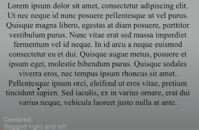 |
| Figure 1.4.4 Centered |
 |
| Figure 1.4.5 Flush Right |
Justified is similar to centering. It creates a symmetrical appearance for the text, by adjusting the spaces between words or letters. The resulting openness of lines can occasionally produce 'rivers' of white space running vertically through the text. To solve this, pay attention to the line breaks and hyphenation. Adjust it if possible.
 |
| Figure 1.4.6 Justified |
3. Texture :
To get the readable text, make sure the X height is larger than normal (ascender and descender).
 |
| Figure 1.4.7 Anatomy of A Typeface |
Type size: Text type should be large enough to be read easily at arm's length.
Leading: Text that is set too tightly encourages vertical eve movement; a reader can easily lose his or her place. A type that is set too loosely creates striped patterns that distract the reader from the material at hand.
Line Length: Shorter lines require less leading; longer lines more. A good rule of thumb is to keep the line length between 55-65 characters. Extremely long or short line lengths impair reading.
 |
| Figure 1.4.8 Bad Leading |
 |
| Figure 1.4.9 Different leading |
5. Type Specimen Book :
A type specimen book is to provide an accurate reference for type, type size, type leading, type line length, etc. Without printed pages showing samples of typefaces of different sizes, no one can make a reasonable choice of type. You only determine the choice on screen when its final version is read on screen.

| Figure 1.4.10 Type Specimen Sheet |
1. Indicating Paragraphs
Pilcrow ¶: A holdover from medieval manuscripts seldom used today.
Paragraph space: If the line space is 12pt, then the paragraph space is 12pt. This ensures cross-alignment across columns of text.
 |
| Figure 1.4.11 Cross-alignment |
Cross-alignment: Lines of the text are aligned with each other when they are placed in symmetry.
 |
| Figure 1.4.12 Cross-alignment |

Standard indentation: Indent is the same size as the line spacing or the same as the point size of your text. (If using indentation, the alignment should be justified.)
 |
| Figure 1.4.14 Standard Indentation |
Extended paragraph: Creates unusually wide columns of text. Despite these problems, there can be strong compositional or functional reasons for choosing it.
 |
| Figure 1.4.15 Extended Paragraph |
2. Widow or Orphans :
Widow: A short line of the type left alone at the end of a column of text.
Orphans: A short line of the type left alone at the start of the new column.
To avoid widows and orphans use Kerning (max +/- 3) or Force line break (Shift + Enter).
 |
| Figure 1.4.16 Widow and Orphans |
3. Highlighting text :
Using Italic / Increasing the boldness or weight of the text / Changing the type family and making it bold / Changing the color of the text / Placing a field of color at the back of the text. |
| Figure 1.4.17 Highlighting Text |
 |
| Figure 1.4.18 Highlighting Text |
When highlighting text by placing a field of color at the back of the text, maintaining the left reading axis (right example) of the text ensures readability is at its best.
 |
| Figure 1.4.19 Highlighting Text |
Sometimes it is necessary to place certain typographic elements outside the left margin of a column of type (extending as opposed to indenting) to maintain a strong reading axis
 |
| Figure 1.4.20 Typographic Elements |
Quotation marks, like bullets, can create a clear indent, breaking the left reading axis. Compare the indented quote at the top with the extended quote at the bottom.
 |
| Figure 1.4.21 Quotation Mark |
4. Headline within the text.
'A' head indicates a clear break between the topics within a section. In the following examples 'A' heads are set larger than the text, in small caps and in bold. The fourth example shows an 'A' head 'extended' to the left of the text.
 |
| Figure 1.4.22 'A' Head |
The 'B' head here is subordinate to 'A' head. 'B' heads indicate a new supporting argument or example for the topic at hand. As such they should not interrupt the text as strongly as 'A' heads do. Here the 'B' heads are shown in small caps. italic, bold serif, and bold san serif.
 |
| Figure 1.4.23 'B' Head |
 |
| Figure 1.4.24 'C' Head |
Week 4 // Typo_5_Understanding

The lowercase letter 'A' (Helvetica & Univers)

2. Maintaining x-height
.png)

3. Form / Counterform
Counterform (or counter): It is important for readability. It was the space between the letter and the letter's stroke.

Contrast is to differentiate the information.

Week 5 // Typo_6_Screen&Print
1. Typography in Different Medium
Print Type vs Screen Type Back before, Type was intended for reading from printing long before we read from the screen. The responsibility of the designers was to make sure that the text is easy to read, flowed well, and it is pleasing to read.
Based on these characteristics, it is elegant, intellectual, and highly readable when set in a small font. Typefaces such as Caslon, Garamond, and Baskerville are the first typographical fonts to consider.
 |
| Figure 1.6.1 Print Type |
 |
| Figure 1.6.2 Print Type |
Typefaces designed for web usage have been optimized and modified to improve their legibility and performance on digital platforms. This required increasing the x-height (while reducing ascenders and descenders), widening fonts, turning on counters, using thicker thin strokes and serifs, reducing stroke contrast, and altering curves and angles for specific designs.
 |
| Figure 1.6.2 Screen Type |
2. Hyperactive Link/ Hyperlink
A hyperlink is a word, phrase, or image that you can click on to jump to a new document or a new section within the current document. Hyperlinks are found on nearly all Web pages, allowing users to click their way from one page to another. Text hyperlinks are normally blue and underlined by default.
3. Font Size for Screen
16-pixel text on a screen is about the same size as text printed in a book or magazine; this accounts for reading distance. As we often read at a close distance (a few inches away), the Printed text is typically set at about 10 points. If you were to read them at arm’s length, you’d want at least 12 points, which is about the same size as 16 pixels on most screens
4. System font for screen / Web safe font :
"Web-safe" fonts are fonts that are available on all operating systems (Windows, MacOS, and Google). Fonts like Open Sans, Lato, Arial, Helvetica, Times New Roman, Times, Courier New, Courier, Verdana, Georgia, Palatino, and Garamond are types of "web-safe" fonts.
5. Pixel Differential Between Devices :
Different screen devices have different text sizes because they have different-sized pixels.
 |
| Figure 1.6.3 Variation In Pixel and Screen Size |
6. Static vs Motion :
 |
| Figure 1.6.4 Static Typography. |
Temporal media offer typographers opportunities to “dramatize” type, for letterforms to become “fluid” and “kinetic” (Woolman and Bellantoni, 1999). Film title credits present typographic information over time, often bringing it to life through animation. Motion graphics, particularly the brand identities of film and television production companies, increasingly contain animated type.
Type is often overlaid onto music videos and advertisements, often set in motion following the rhythm of a soundtrack. On-screen typography has developed to become expressive, helping to establish the tone of associated content or express a set of brand values. In title sequences, typography must prepare the audience for the film by evoking a certain mood.
Figure 1.6.5 Motion Typography. (credits: YouTube)
INSTRUCTIONS
Sketches

Digitization
First Attempt

Second Attempt

Final Task 1 - Exercise 1: Type Expressions

Figure 2.5 Final Digitized in Type Expression pdf (18.04.23)
Animation
I have my first attempt at the word "Freedom".
When I think about freedom, the word "free" pops out in my mind. Then, I felt happy when I had an imagination about when I was free. As you saw in Figure 3.1 a happy face appears at the end.

I got the feedback from Mr. Vivod: 'It was nice that it got movement, but I don't understand why is this freedom. It doesn't express the word "Freedom".
I felt a bit hard to express it, so I changed to the word "Crush".
As you see in Figure 3.2 the two black objects that used to crush "crush" got a bit of movement from down to up (end part), and shaking a little bit (middle part). The purpose of designing these is to make a shaking version to make it look interesting. It will be better than just letting them stay in one position to crush "Crush".

Final Animated Type Expression

Task 1 / Exercise 2 - Text Formatting
We are been given a text to format in this task by using type choice, type size, leading, line length, paragraph spacing, forced-line-break, alignment, kerning, widows and orphans, and cross-alignment. Lecture videos will help while doing this task.
Kerning and tracking
Before starting this exercise, I practiced kerning and tracking with my name.

Follow the tutorial videos by using the text provided, and do some tryouts.
%20(2).jpg)
Final Text Formatting Layout
Font/s: Bembo Std
Type Size/s: 38pt & 58pt
Leading: 41pt & 61pt
Paragraph spacing: 0
Body Text
Font/s: Bembo Std
Type Size/s: 12 pt
Leading: 14 pt
Paragraph spacing: 14 pt
Characters per line: 66
Alignment: Align left
Margins: Top: 12.7mm top, Bottom: 12.7mm top, Inside: 12.7mm top, Outside: 12.7mm top
Columns: 2
Gutter: 5 mm


FEEDBACK
Week 3 General feedback: Make it obvious. Maybe can change to a suitable font. Specific feedback: Too many graphical elements for 'rain'. Maybe changing the font and force on the letter is enough. Don't stretch the 'crush', narrow the space between the letters and the walls. Make the '!' more obvious by having some changes in the space. 'Freedom' doesn't show the meaning of it. By designing it from small to big, maybe can arrange it into some kind of emotion.
Week 4 General feedback: Nice idea, but it doesn't relate to the word 'freedom' Specific feedback: The idea of popping out and moving is good, but it doesn't express the meaning of freedom. 'How and why is it freedom?'
Week 5 General feedback: Watch the videos again. Specific feedback: Change the font. choose a picture in black and white that is also relevant to the content.
REFLECTIONS
FURTHER READINGS


Chapter Four introduces special glyphs (foreign characters and special symbols) that are available on most computers.
 |
| Figure 8.1 Chapter 4: Special Glyphs (pg 14) |
Chapter five talks about line spacing which is also known as leading. Line spacing refers to the amount of space between lines of text. Line spacing is based on the chosen font, line length, and font size. The baseline grid is to enables cross-aligns to be established across pages.


.jpg)
Comments
Post a Comment